

Natural Linen Bedding Colours to Watch in 2026
There is a particular kind of tired that only shows up at bedtime - when the room is tidy enough, the mobile phone is finally down, and the bed still feels visually loud. In 2026, the most persuasive bedding trend is the one that quiets everything: natural colours in real linen that look better in the morning light than they do on a screen.
The shift is not about beige for the sake of it. It is about linen bedding that works with Irish daylight, central heating, coastal humidity, and the way a bedroom actually gets used. If you are choosing a new set this year, the headline is simple: the linen bedding trends 2026 natural colours story is about warmer neutrals, grounded earth tones, and subtle depth - with a growing preference for shades that age gracefully through wash, wear, and seasons.
Linen bedding trends 2026 natural colours - what is changing?
Natural colour palettes have been around for years, but 2026 is pushing them in a more lived-in, material-led direction. Instead of stark, “perfect” neutrals, we are seeing tones that mimic undyed fibre, sun-warmed stone, weathered timber, peat, and clay. They feel less styled and more believable, which matters when linen’s charm is its texture and movement.
The other change is confidence. People are buying fewer, better pieces and expecting them to carry a room. That makes colour choice more strategic. The most successful natural shades for 2026 do two things at once: they calm the space, and they add enough character that you do not need a busy headboard, patterned wallpaper, or a pile of decorative cushions to make the bed feel finished.
There is also a practical angle. Linen creases - that is part of the appeal - but colour can either highlight or soften those creases. Mid-toned naturals tend to make linen look intentionally relaxed, while very bright whites can read more “crumpled” unless you love a crisp look and are happy to smooth and fold often.
The 2026 palette: the new neutrals that do not feel flat
If you are used to choosing between white, grey, and oatmeal, 2026 gives you more nuance. Think of neutrals as a spectrum rather than a single safe choice.
Warm off-whites are leading. Not optic white, but cream, chalk, and soft ivory that flatter skin tones and look inviting under warm bedside lighting. They are a strong choice if your bedroom leans modern but you want it to feel less clinical.
Oat, flax, and sand shades continue to dominate because they echo linen’s natural origin. They also hide everyday lint and minor marks better than pure white, which makes them ideal if you eat breakfast in bed or share with kids or pets.
Stone and putty tones sit in the middle - less yellow than oat, less blue than grey. They work beautifully in Irish homes with cool daylight and are an easy match for light oak furniture, painted skirting boards, and older period features.
Then there is the “mushroom” family: taupe and soft brown-greys with a slightly earthy base. These shades are quietly luxurious and very forgiving. They are also one of the best choices if you like a minimal room but want it to feel expensive rather than plain.
Earth tones are back, but they are softer and more wearable
The earth-tone revival is not the saturated terracotta of a few years ago. In 2026, the shades are dustier, calmer, and designed to sit comfortably with neutrals.
Clay, baked earth, and muted terracotta add warmth without turning the bedroom orange. Used on a duvet cover, they make even a plain room feel intentional. Paired with flax or cream sheets, they read modern and grounded.
Olive, moss, and lichen greens are the most versatile “natural colour” of the year. They work with both warm and cool interiors and make a bedroom feel restorative. Green linen also tends to look better as it softens over time, taking on depth rather than fading into nothing.
Deep naturals are gaining momentum too: bark brown, peat, and inked charcoal. These are not bright statement colours, but they create contrast and a sense of shelter - especially in winter. The trade-off is visible lint and the fact that very dark shades can show water marks more easily if you spill and spot-clean. If you love dark linen, commit to gentle full washes rather than quick local scrubbing.
Why natural colours suit linen better than “perfect” tones
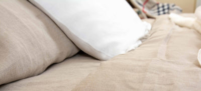
Linen is not a flat fabric. It has slubs, variation, and a matte finish that catches light differently across the day. Natural colours amplify those qualities rather than fighting them. That is why a flax-toned linen duvet can look richer than a bright, uniform dye, even if the palette is restrained.
Natural colours also align with how linen performs. Linen regulates temperature, wicks moisture, and feels cool at first touch, then cosy as it warms. A calm palette reinforces that sensory promise. It is hard to sell “sleep sanctuary” with neon bedding, no matter how good the fibre is.
If sustainability is part of your purchasing decisions, natural tones often sit well with the idea of buying less and keeping items longer. They are less likely to date, and they mix across collections and seasons. The trade-off is that if you live for trend-led looks, naturals will not deliver that quick seasonal refresh. They are chosen for staying power.
Styling natural linen in real Irish bedrooms
Most bedrooms here are not huge, and many deal with mixed light: grey mornings, strong afternoon sun in summer, warm lamps in winter. Natural colours handle that variation better than high-contrast schemes.
If you want the bed to look hotel-clean, go for a warm off-white duvet and pillowcases, then add depth with a throw in oat or stone. This gives you that bright, lifted feeling without the harshness of pure white.
If you are after a more relaxed, heritage feel, layer within one family: flax sheets, sand pillowcases, and a putty duvet cover. The small shifts in tone create texture without adding visual noise.
For a modern, grounded look, pick a mid-to-deep earth tone for the duvet cover - olive or clay - and keep the sheets lighter. The contrast frames the bed neatly, and it makes linen’s drape stand out.
Pattern can still work in 2026, but it is quieter. Subtle stripes, small checks, or a gentle melange effect are more in keeping with the natural theme than bold prints. If you are pattern-shy, texture does the job: a heavier linen throw at the foot of the bed creates that “styled” finish without a single motif.
The less glamorous part: how colour interacts with fabric weight and use
For buyers who care about the feel as much as the look, it is worth considering weight and weave alongside colour. A lighter or standard linen often looks airier and slightly more rumpled, which suits pale naturals and casual styling. Heavier linen tends to drape with more structure and can make deeper colours look particularly rich.
It also depends on where the bedding is used. Guest rooms can handle lighter shades because they are washed less often and see fewer spills. Everyday family bedrooms might be better served by mid-tone naturals that are forgiving between washes.
If you are buying for sensitive skin, natural tones can be appealing because they visually signal minimalism, but the real comfort comes from quality fibre and finishing. Look for linen that is breathable, softening with each wash, and made to last - not overly treated to feel “instant soft” at the expense of longevity.
Buying well in 2026: a colour-first checklist that saves regret
Natural colours can look similar online, so it pays to choose with your room in mind rather than chasing a name on a swatch.
Start with your light. North-facing rooms and shaded terraces often benefit from warmer neutrals and clay-based tones. Bright, sunlit rooms can take cooler stone shades or deeper greens without feeling heavy.
Then consider what you already own. If your walls are warm white, choose bedding that is either clearly warm (cream, oat) or clearly deeper (olive, peat) - the in-between can sometimes look unintentionally “dingy” if it is too close to the wall colour but not quite matching.
Finally, be honest about laundry habits. If you like a crisp look, choose tones that forgive creasing less, such as off-white, and enjoy the ritual of making the bed. If you want linen to look effortlessly good with minimal fuss, mid-tones like putty, mushroom, and olive are your best friends.
If you are shopping for premium, hand-finished linen made locally, PureLinen.IE focuses on natural comfort, durable European flax linen, and a palette designed to live well in everyday Irish homes.
Natural colour does not mean boring - it means flexible
One of the strongest 2026 shifts is how people build bedding wardrobes. Instead of buying one “set” and stopping, shoppers are choosing a base palette and adding one or two pieces that change the mood. Natural colours make that easy.
A flax sheet set can carry you through every season. Add an olive duvet cover for autumn and winter depth, then switch to chalk or sand for spring and summer brightness. If you prefer deeper tones year-round, keep the duvet dark and lighten the sheets and pillowcases for a fresh edge.
The real advantage is that you can refresh the room without replacing everything. That is better for budgets and better for sustainability, and it keeps linen’s longevity working in your favour.
A helpful closing thought
When you are choosing natural-coloured linen for 2026, pick the shade you will still want to see when you are tired, busy, and not trying to impress anyone - that is the colour that earns its place on your bed.

Leave a comment